早見回答:Minecraft の配色を選ぶ方法
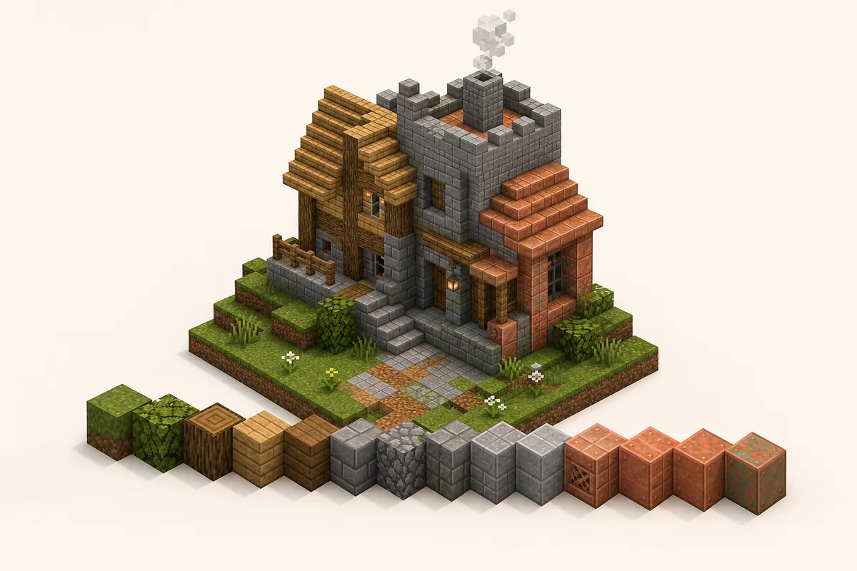
Minecraft の配色は、主役の素材系統、近い中間ブロック、小さなアクセントを分けると安定します。家、道、壁、屋根、洞窟など目的を先に決め、明るさと素材感の流れを作ります。
Minecraft の配色は、主役の素材系統、近い中間ブロック、小さなアクセントを分けると安定します。家、道、壁、屋根、洞窟など目的を先に決め、明るさと素材感の流れを作ります。 ブロック同士が色温度、明るさ、素材の理由を共有していると配色は自然に見えます。逆に強い色を同じ量で並べると、奥行きではなくノイズになります。
60/30/10 rule keeps the palette readable: most of the surface is the main block family, transitions soften the edge, and accents stay small.
Fast palette recipe
- Pick one build theme before choosing blocks.
- Choose a main color family: warm, cool, neutral, dark or natural.
- Add two or three transition blocks with similar texture density.
- Reserve bright, black, copper, prismarine or glazed blocks for accents.
- Test a 7-by-7 patch under the same lighting as the final build.
- Turn the palette into a gradient only after the color family feels coherent.
Why Minecraft Color Palettes Fail or Work
ブロック同士が色温度、明るさ、素材の理由を共有していると配色は自然に見えます。逆に強い色を同じ量で並べると、奥行きではなくノイズになります。
ブロック同士が色温度、明るさ、素材の理由を共有していると配色は自然に見えます。逆に強い色を同じ量で並べると、奥行きではなくノイズになります。 Keep rare or bright blocks as support, not as an equal repeated pattern.
For official block names and version-specific additions, check the Minecraft block reference before planning a survival material list.
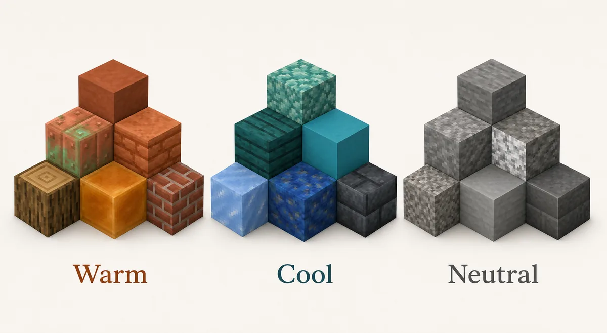
暖色、寒色、ニュートラルに分けて考えると、候補ブロックを絞りやすくなります。ニュートラルな stone 系は多くのアクセントを受け止めます。
If you already know your material family, use the Minecraft Gradient Generator to test the order of adjacent blocks before placing hundreds of blocks in-game.
9 Minecraft Color Palettes for Common Builds
Use these Minecraft block palettes as starting points. Swap blocks based on biome, resource pack, shader brightness and survival access.
| Use Case | Block Palette | Best Placement |
|---|---|---|
| Cozy starter house | oak planks -> stripped oak -> spruce planks -> barrel -> lantern | Oak carries the walls, spruce shapes the roof edge, barrels and lanterns stay as small warm accents. |
| Stone castle wall | stone bricks -> stone -> andesite -> tuff bricks -> cracked stone bricks -> deepslate bricks | Keep stone high and central, then darken buttresses, base blocks and corners. |
| Forest cabin | stripped spruce -> spruce planks -> dark oak -> moss block -> azalea leaves | Wood forms the structure, moss and leaves connect the cabin to the ground. |
| Desert village | sandstone -> cut sandstone -> smooth sandstone -> terracotta -> mud bricks | Stay warm and dusty; use stronger orange only as an accent. |
| Nether base | blackstone -> polished blackstone -> basalt -> crimson planks -> shroomlight | Dark neutral blocks dominate, crimson and shroomlight mark focal details. |
| Ocean build | prismarine -> dark prismarine -> warped planks -> cyan terracotta -> sea lantern | Use sea lanterns as highlights rather than a full wall material. |
| Cave entrance | grass block -> coarse dirt -> gravel -> stone -> tuff -> deepslate | Blend outdoor terrain into the darker interior instead of cutting a hard doorway. |
| Black palette | gray concrete -> deepslate tiles -> polished blackstone -> blackstone -> tinted glass | Use black for trim, floors and shadow zones; keep mid-gray blocks for readability. |
| Copper accent build | bricks -> mud bricks -> exposed copper -> weathered copper -> spruce trapdoors | Let copper mark roofs, pipes or machinery while brick and wood carry the main structure. |
Warm, Cool and Neutral Block Families
暖色、寒色、ニュートラルに分けて考えると、候補ブロックを絞りやすくなります。ニュートラルな stone 系は多くのアクセントを受け止めます。
暖色、寒色、ニュートラルに分けて考えると、候補ブロックを絞りやすくなります。ニュートラルな stone 系は多くのアクセントを受け止めます。 Neutral palettes are usually the easiest base because they support wood, copper, plants and lighting without losing readability.
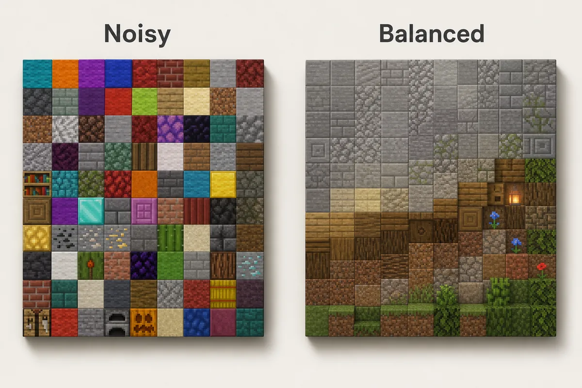
How to Use a Palette Without Making the Build Noisy
最初に主素材を置き、角、影、地面との接点、古びた部分にだけ中間ブロックを足します。アクセントは視線を止めたい場所に限定します。
最初に主素材を置き、角、影、地面との接点、古びた部分にだけ中間ブロックを足します。アクセントは視線を止めたい場所に限定します。 Avoid straight stripes unless the build is intentionally stylized.
Lighting, shaders and biome colors can change the result, so test a small patch before repeating the palette.
For large surfaces, use clusters and edges instead of random single blocks.
Main block
The material that carries the build shape from a distance. It should usually be the highest percentage.
Transition block
The block that softens a jump between colors, such as tuff between stone and deepslate.
Accent block
A small, stronger color or texture used to mark details, not cover the whole surface.
Survival-Friendly Palette Choices
サバイバルでは大量に集められる oak、spruce、stone、cobblestone、andesite、dirt、moss を中心にし、貴重なブロックは10%のアクセントにします。
サバイバルでは大量に集められる oak、spruce、stone、cobblestone、andesite、dirt、moss を中心にし、貴重なブロックは10%のアクセントにします。 Replace blocks later by role so upgrades still look intentional.
Use expensive blocks at doors, roofs, portals, trim or lighting rather than as the entire wall.
Common Minecraft Palette Mistakes
Choosing blocks only from inventory color
Inventory icons are useful, but blocks change once they touch neighbors, lighting and biome color. Test them in the final context.
Using every accent at equal strength
Gold, diamond, copper, warped wood and shroomlight all demand attention. Let one accent lead and keep the rest quiet.
Ignoring texture density
Smooth concrete beside noisy cobblestone can work, but too many texture densities in one surface make the build hard to read.
Treating black as a normal midtone
Blackstone and black concrete are powerful shadow tools. If they cover too much area, the palette becomes heavy and details disappear.
Forgetting biome color
Grass, leaves and water shift by biome. A palette that looks balanced in plains may feel different in swamp, cherry grove, desert or snowy areas.
FAQ
What is a good Minecraft color palette for beginners?
Use oak or spruce as the main block, stone or cobblestone as the neutral support, and one accent such as copper, lanterns, leaves or dark oak. This gives enough contrast without making the build noisy.
How many blocks should be in a Minecraft palette?
Most builds work well with 4 to 7 blocks: one main block, two or three transition blocks, one or two accents and sometimes one lighting block. Large gradients can use more, but only when the brightness steps are clear.
Is black a good Minecraft palette color?
Yes, but black should usually act as a shadow or trim color. Polished blackstone, blackstone, black concrete and tinted glass are strong, so combine them with gray, wood or warm lighting to keep detail visible.
Should I use a color palette generator or choose blocks manually?
Use a generator to explore nearby colors and gradient order, then choose manually based on texture, material logic, lighting and survival access. Color alone is not enough for Minecraft builds.
What is the difference between a palette and a gradient?
A palette is the set of blocks that belong together. A gradient is the order and placement that moves between those blocks. Build the palette first, then decide whether a gradient is needed.
Turn Your Palette Into a Buildable Gradient
Once the block family feels coherent, test the order in the generator and adapt the sequence to your wall, path, roof or terrain shape.
Use the Minecraft Gradient Generator