Quick Answer: How to Pick a Minecraft Color Palette
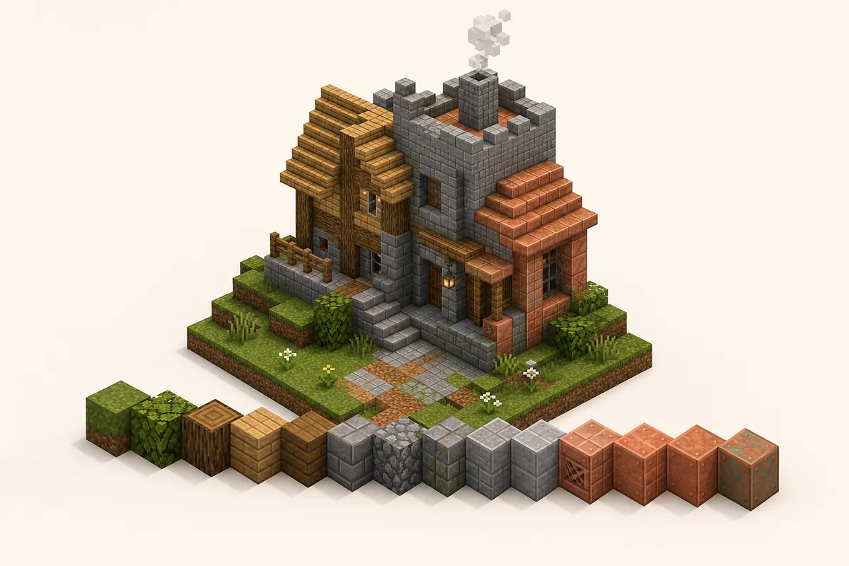
The safest Minecraft color palette starts with one main block family, one nearby transition family and one small accent. For example, a cozy village palette can use oak planks as the main material, stripped spruce and barrels as transitions, then copper or lanterns as accents. A cliff palette can use stone and andesite first, tuff as the middle step and deepslate only where the surface should feel darker.
Do not begin by collecting every block that looks interesting. Start with the build job: house, path, wall, roof, cave, bridge, floor or fantasy structure. Then choose a brightness direction, such as light roof to dark eaves, warm entrance to cool stone, or grass edge to dirt path. If the palette cannot explain where each color belongs, it will usually look random once it is repeated across a large build.
A practical rule is 60/30/10: about 60% main block, 30% transition blocks and 10% accent blocks. The exact ratio can change, but the idea keeps a Minecraft block palette readable from a distance while still giving enough texture up close.
Fast palette recipe
- Pick one build theme before choosing blocks.
- Choose a main color family: warm, cool, neutral, dark or natural.
- Add two or three transition blocks with similar texture density.
- Reserve bright, black, copper, prismarine or glazed blocks for accents.
- Test a 7-by-7 patch under the same lighting as the final build.
- Turn the palette into a gradient only after the color family feels coherent.
Why Minecraft Color Palettes Fail or Work
Minecraft palettes work when the blocks share at least two of three traits: color temperature, brightness and material logic. Oak, spruce, barrels and stripped logs work together because they are all warm wood textures. Stone, andesite, tuff and deepslate work because they are gray rocky materials with a believable light-to-dark movement.
They fail when a build mixes unrelated colors at the same strength. Diamond blocks, warped planks, red nether brick, gold, hay and polished blackstone can all be useful blocks, but placing them evenly in one wall creates noise rather than depth. A strong accent needs quiet support blocks around it.
For official block names and version-specific additions, check the Minecraft block reference before planning a survival material list.
Think about distance. A small decorative corner can handle more contrast than a large castle wall. On big surfaces, use close colors and change texture slowly. On details like trim, window frames, signs or market stalls, sharper color jumps can help the shape read clearly.
If you already know your material family, use the Minecraft Gradient Generator to test the order of adjacent blocks before placing hundreds of blocks in-game.
9 Minecraft Color Palettes for Common Builds
Use these Minecraft block palettes as starting points. Swap blocks based on biome, resource pack, shader brightness and survival access.
| Use Case | Block Palette | Best Placement |
|---|---|---|
| Cozy starter house | oak planks -> stripped oak -> spruce planks -> barrel -> lantern | Oak carries the walls, spruce shapes the roof edge, barrels and lanterns stay as small warm accents. |
| Stone castle wall | stone bricks -> stone -> andesite -> tuff bricks -> cracked stone bricks -> deepslate bricks | Keep stone high and central, then darken buttresses, base blocks and corners. |
| Forest cabin | stripped spruce -> spruce planks -> dark oak -> moss block -> azalea leaves | Wood forms the structure, moss and leaves connect the cabin to the ground. |
| Desert village | sandstone -> cut sandstone -> smooth sandstone -> terracotta -> mud bricks | Stay warm and dusty; use stronger orange only as an accent. |
| Nether base | blackstone -> polished blackstone -> basalt -> crimson planks -> shroomlight | Dark neutral blocks dominate, crimson and shroomlight mark focal details. |
| Ocean build | prismarine -> dark prismarine -> warped planks -> cyan terracotta -> sea lantern | Use sea lanterns as highlights rather than a full wall material. |
| Cave entrance | grass block -> coarse dirt -> gravel -> stone -> tuff -> deepslate | Blend outdoor terrain into the darker interior instead of cutting a hard doorway. |
| Black palette | gray concrete -> deepslate tiles -> polished blackstone -> blackstone -> tinted glass | Use black for trim, floors and shadow zones; keep mid-gray blocks for readability. |
| Copper accent build | bricks -> mud bricks -> exposed copper -> weathered copper -> spruce trapdoors | Let copper mark roofs, pipes or machinery while brick and wood carry the main structure. |
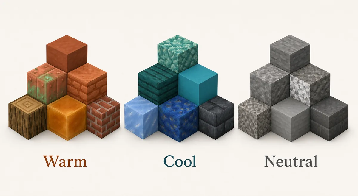
Warm, Cool and Neutral Block Families
Before you make a gradient, sort blocks into families. Warm palettes use oak, jungle, bricks, terracotta, copper, mud bricks and orange lighting. Cool palettes use prismarine, warped wood, cyan terracotta, ice, oxidized copper and darker blue-green blocks. Neutral palettes use stone, andesite, tuff, cobblestone, calcite, gravel, deepslate and blackstone.
A neutral family is the easiest base because it accepts many accents. A warm palette feels welcoming and handmade, but it can become muddy if every block is orange or brown. A cool palette looks magical or aquatic, but it needs neutral anchors so it does not feel like a flat color sheet.
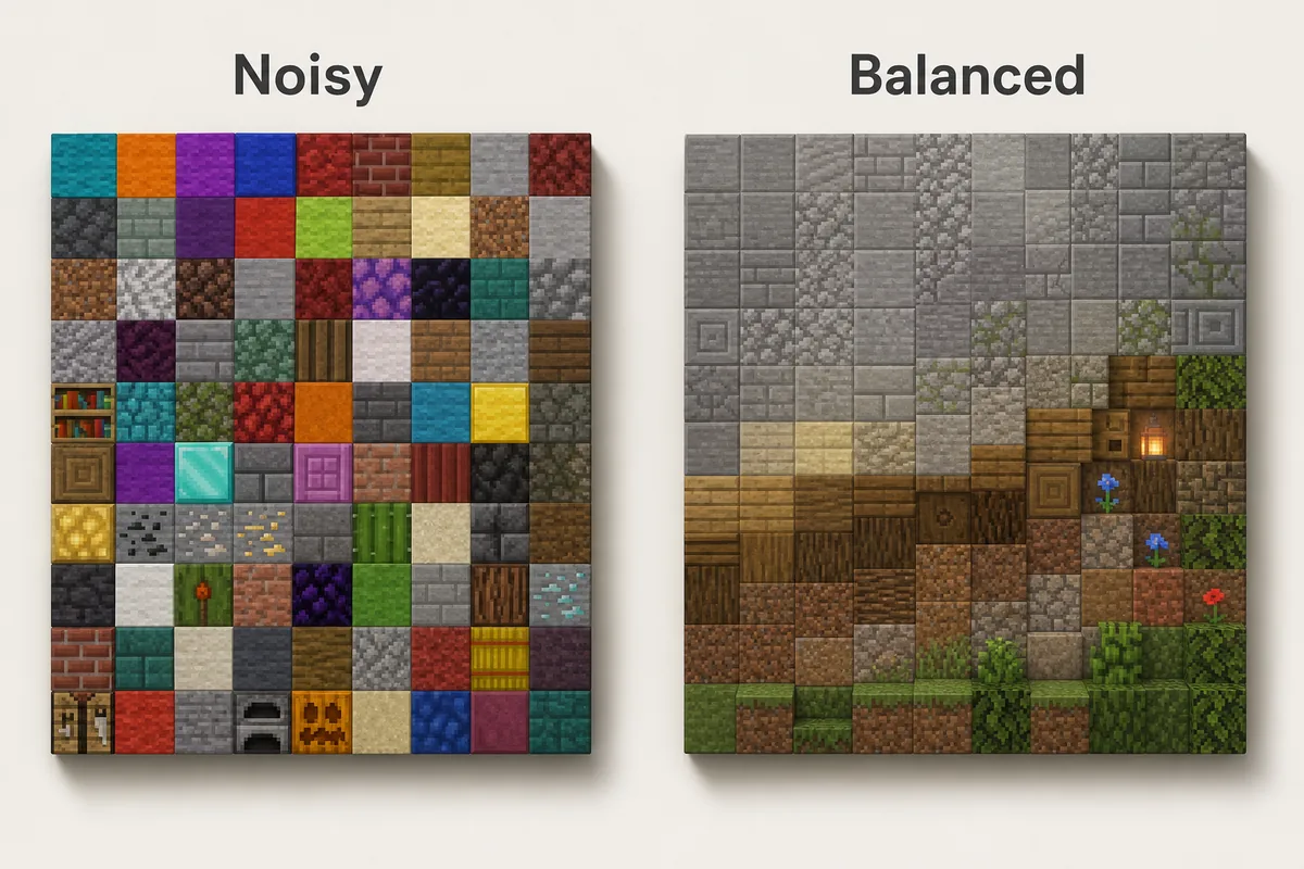
How to Use a Palette Without Making the Build Noisy
Place the main block first. If the palette is for a house, fill the walls or roof with the block that should define the build. Then add transition blocks only along edges, corners, shadow zones, weathered areas, slopes or terrain contact. This keeps the palette from turning into a random checkerboard.
Use accents where the eye should stop: door frames, chimneys, roof ridges, bridge supports, window trim, shop signs, machinery, lantern chains or floor patterns. If every section has the same accent density, the accent stops working.
For gradients, avoid straight stripes unless the build is intentionally stylized. Break edges into clusters, scatter a few middle blocks into both neighboring zones and keep the direction visible. A grass-to-path transition should still read as terrain fading into a walkway, not as unrelated pixels.
Lighting changes the palette. Copper, blackstone, deepslate and warped blocks can look much darker indoors than they do in daylight. Always test the palette where it will actually be used, especially under torches, lanterns, shaders or a resource pack.
Main block
The material that carries the build shape from a distance. It should usually be the highest percentage.
Transition block
The block that softens a jump between colors, such as tuff between stone and deepslate.
Accent block
A small, stronger color or texture used to mark details, not cover the whole surface.
Survival-Friendly Palette Choices
In survival, choose palettes around blocks you can gather repeatedly. Oak, spruce, stone, cobblestone, andesite, dirt, moss, terracotta and basic bricks are easier to scale than rare decorative blocks. A simple palette used consistently often looks better than a perfect palette you can only place in tiny amounts.
Build expensive blocks into focal points. Copper, sea lanterns, blackstone, quartz, glazed terracotta and deepslate variants can define trim, roofs, portals or entrances without becoming a resource grind. If a block is slow to farm, use it as the 10% accent instead of the 60% base.
When you upgrade later, replace blocks by role. Swap cobblestone for stone bricks in structured areas, add polished tuff between stone and deepslate, or replace plain wood edges with trapdoors and stripped logs. Keeping the role system makes upgrades look intentional.
Common Minecraft Palette Mistakes
Choosing blocks only from inventory color
Inventory icons are useful, but blocks change once they touch neighbors, lighting and biome color. Test them in the final context.
Using every accent at equal strength
Gold, diamond, copper, warped wood and shroomlight all demand attention. Let one accent lead and keep the rest quiet.
Ignoring texture density
Smooth concrete beside noisy cobblestone can work, but too many texture densities in one surface make the build hard to read.
Treating black as a normal midtone
Blackstone and black concrete are powerful shadow tools. If they cover too much area, the palette becomes heavy and details disappear.
Forgetting biome color
Grass, leaves and water shift by biome. A palette that looks balanced in plains may feel different in swamp, cherry grove, desert or snowy areas.
FAQ
What is a good Minecraft color palette for beginners?
Use oak or spruce as the main block, stone or cobblestone as the neutral support, and one accent such as copper, lanterns, leaves or dark oak. This gives enough contrast without making the build noisy.
How many blocks should be in a Minecraft palette?
Most builds work well with 4 to 7 blocks: one main block, two or three transition blocks, one or two accents and sometimes one lighting block. Large gradients can use more, but only when the brightness steps are clear.
Is black a good Minecraft palette color?
Yes, but black should usually act as a shadow or trim color. Polished blackstone, blackstone, black concrete and tinted glass are strong, so combine them with gray, wood or warm lighting to keep detail visible.
Should I use a color palette generator or choose blocks manually?
Use a generator to explore nearby colors and gradient order, then choose manually based on texture, material logic, lighting and survival access. Color alone is not enough for Minecraft builds.
What is the difference between a palette and a gradient?
A palette is the set of blocks that belong together. A gradient is the order and placement that moves between those blocks. Build the palette first, then decide whether a gradient is needed.
Turn Your Palette Into a Buildable Gradient
Once the block family feels coherent, test the order in the generator and adapt the sequence to your wall, path, roof or terrain shape.
Use the Minecraft Gradient Generator